CSS Flexbox and Grid
Why#
Today, not every user is viewing your web app with the same size screen. In fact, users will be viewing your web pages with MANY different devices that all have varying device-width and device-height. This means that you need to account for each possible view that a user has on your apps. Thus, you need to add responsiveness to your web pages.
What and How#
FlexBox#
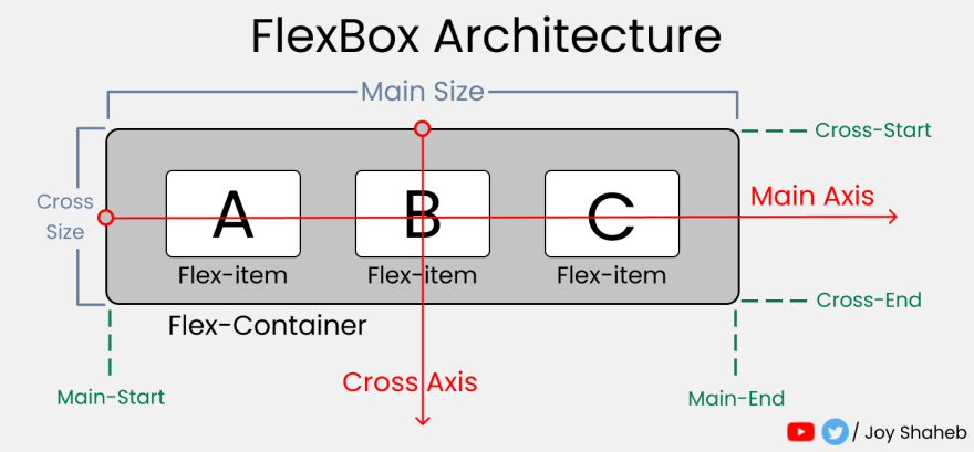
Flexbox is an extremely useful tool for responsive web design. Here’s how it works

READING RESOURCE: Flexbox Cheat Sheets in 2021 by Joy Shaheb PRACTICE RESOURCE: Flexbox Zombies, Learning Game
CSS Properties#
justify-content- determines items’ placement across the main axisalign-items- determines all items’ placement across the cross axisalign-self- determines an item’s placement across the cross axisflex-grow- grows an item based on width of the flex-containerflex-shrink- shrinks an item based on width of the flex-containerflex-wrap- determines how many items occupy a line (row)
The result on desktop:
The result on mobile:
"This is where the fun begins"
Grid#
Columns and rows#
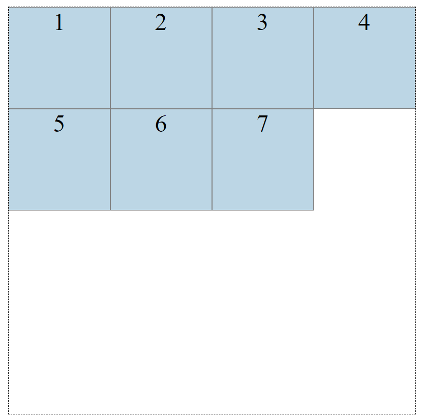
Grids are two-dimensional, with columns and rows. Let’s look at how to create a grid with 4 columns and 4 rows. We’ll use the grid-template-row and grid-template-column properties.
Above, we have 4 pixel values for the columns, and 4 pixel values for the rows.
The values dictate how wide we want our columns to be (200px) and how tall we’d want our rows to be (200px). Let’s look at the result:

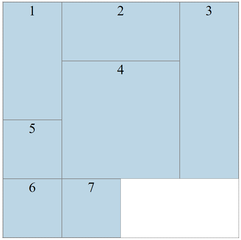
We can position or resize the boxes selecting them and using the grid-column-start, grid-column-end, grid-row-start and grid-row-end properties
And now our grid looks like this:

Neat! But, we still haven’t reached a responsive grid layout. Introducing the fraction unit. The fraction unit, fr, allows you to split the wrapper into as many fractions as you want.
Let’s change the column values from 200px to fr units:
NOTE: Fraction units are dependent on the the width of the grid
With fr units, the grid will work with the space that is provided, and always give you the columns or rows specified.
But, we have only learned to create a handy layout tool. Our grid still isn’t responsive.
Welcome to functions in CSS. We can use the repeat() and minmax() functions to reach responsiveness.
repeat(number of times, unit) - so let’s refactor our CSS:
minmax(min value, max value) - let’s put this inside our repeat() function
The minmax(min, max) function determines a size range greater than or equal to min and less than or equal to max.
Now our columns will always be at least 200px, but if there is more space, our grid will distribute the space equally to each of the columns, as the columns become 1 fr instead of 200px.
Relative Units and Media Queries#
Up to this point, we've used many static units for sizing elements, padding, margin, border, etc. If we are trying to accomplish a responsive web design, responsive units are very convenient.
| Value | Description |
|---|---|
% | percentage of the container's size |
em | ratio size based on the cascaded font-size |
rem | ratio size based on the root font-size |
vw | percentage of the viewport width |
vh | percentage of viewport height |
vmin | percentage of viewport smaller dimension |
vmax | percentage of viewport larger dimension |
Along with relative units, we can use media queries to apply specific rulesets based on the size of the media.
For example, if we wanted the width of our sidebar to be 30% of the container's width on laptop or desktop screens, but 5% on tablet or mobile devices, we could add the following media query:
Above we have a ruleset applied to the element with classname sidebar. The width is set to 5% of the container's width. We also have a media query that checks for the viewport to have atleast a width of 998px, and if so, will apply a width of 30% to the sidebar element.
Bootstrap#
READING RESOURCE: Bootstrap Docs
Bootstrap was created by developers at Twitter in 2010. Now, it is one of the most popular front-end frameworks and open source projects in the world.
Bootstrap allows you to utilize it’s CSS and JS framework to "quickly design and customize responsive mobile-first sites."
Using Bootstrap is easy. The fastest way to get started is by adding a stylesheet link in your <head></head> tag in your html.
NOTE: You must put the Bootstrap link before your own external stylesheet link.
With Bootstrap, you can add class names to your html elements to add Bootstrap’s styling. Try it out.
Is there anything other than Bootstrap? Many, to say the least.
Here’s a couple more to choose from:
READING RESOURCE: Tailwind READING RESOURCE: Materialize
Takeaways#
- CSS Flexbox makes it easier to position content relative to a containing element
- CSS Grid makes it easier to create grid (row and column) layouts
em,rem,vh,vw, andvminare CSS relative units